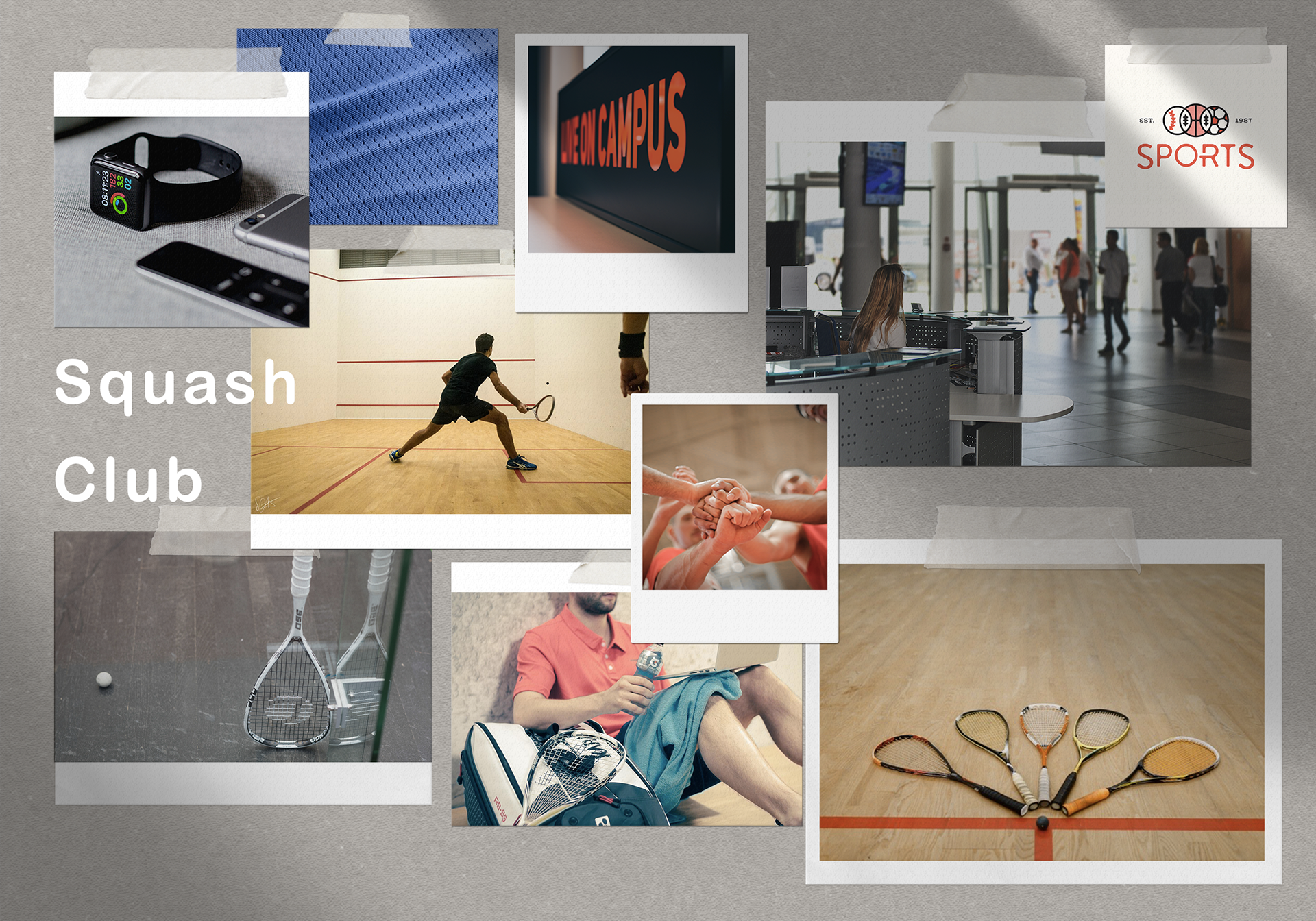
Collaborating with the Copenhagen Squash Club, a new sports organisation affiliated with Copenhagen Business School (CBS), a prominent Danish university, the mission was clear: to develop a captivating and distinctive graphic identity that not only embodies the club's fervour for squash but also underscores its ties to CBS.
Timeline
2 months • 2020
Role
Graphic Designer
The Challenge
Central to the project was the task of creating a logo that seamlessly integrates the essence of squash with its association with CBS. The aim was to craft a visual identity that resonates with both the vibrant energy of the sport and the academic excellence of the institution.
The Research Question
How can we create an identity that embodies the club's dedication to squash while highlighting its association with Copenhagen Business School?
The Process
Through close collaboration with stakeholders, including club members and CBS representatives, it was possible to gain valuable insights that informed the creative process

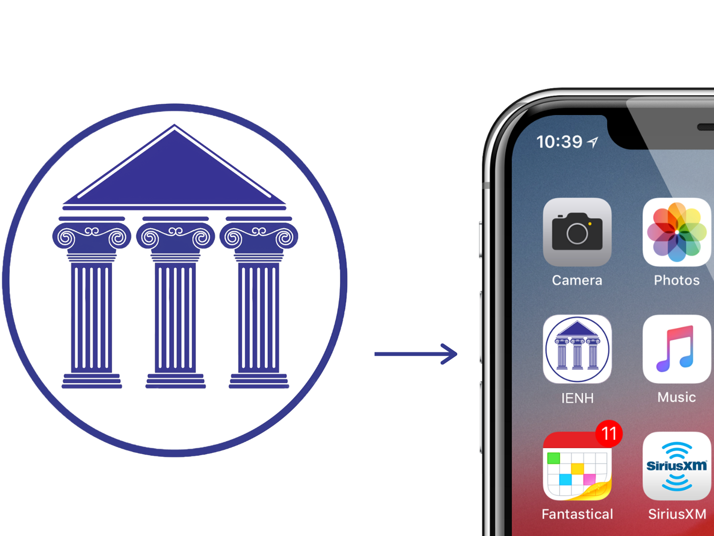
The current official logo of Copenhagen Business School, used as a base.
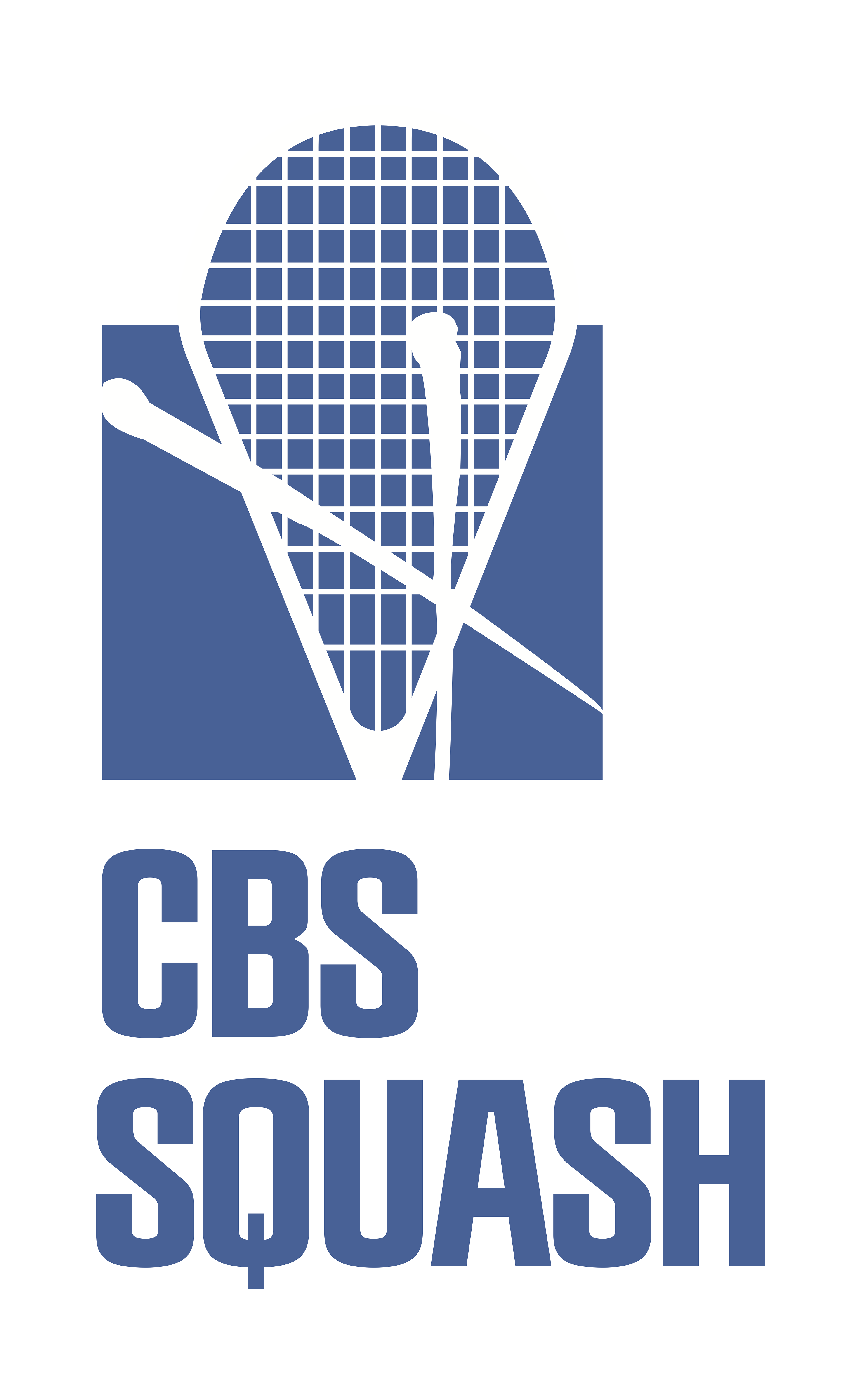

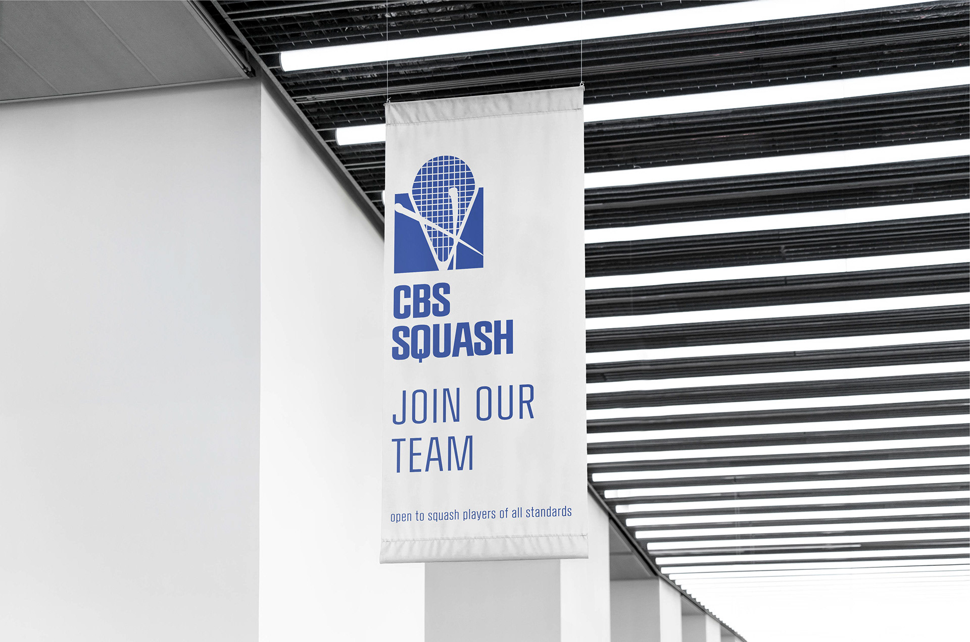
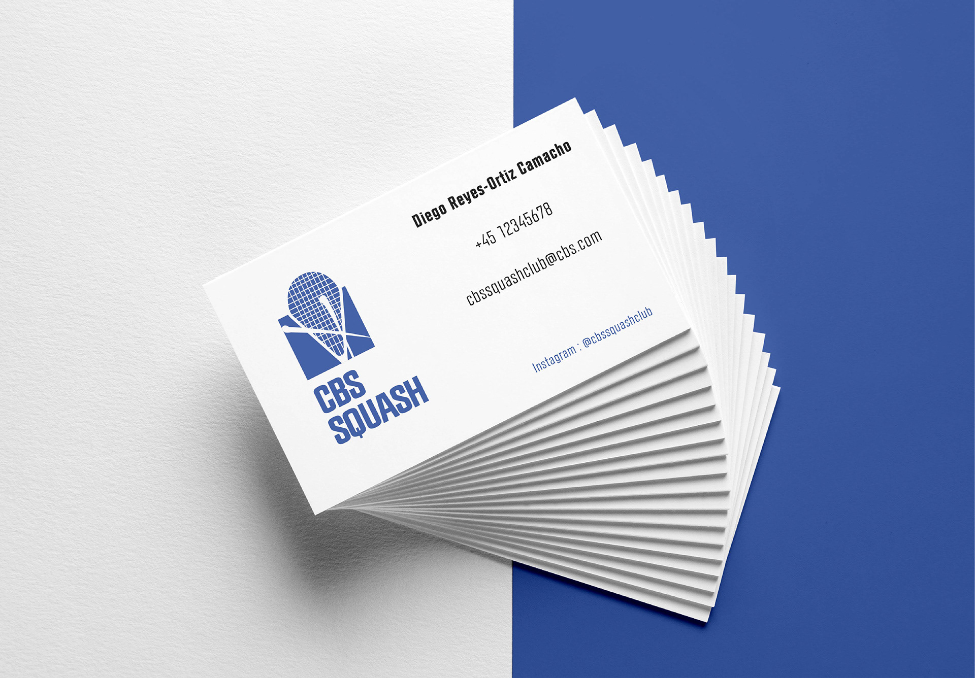
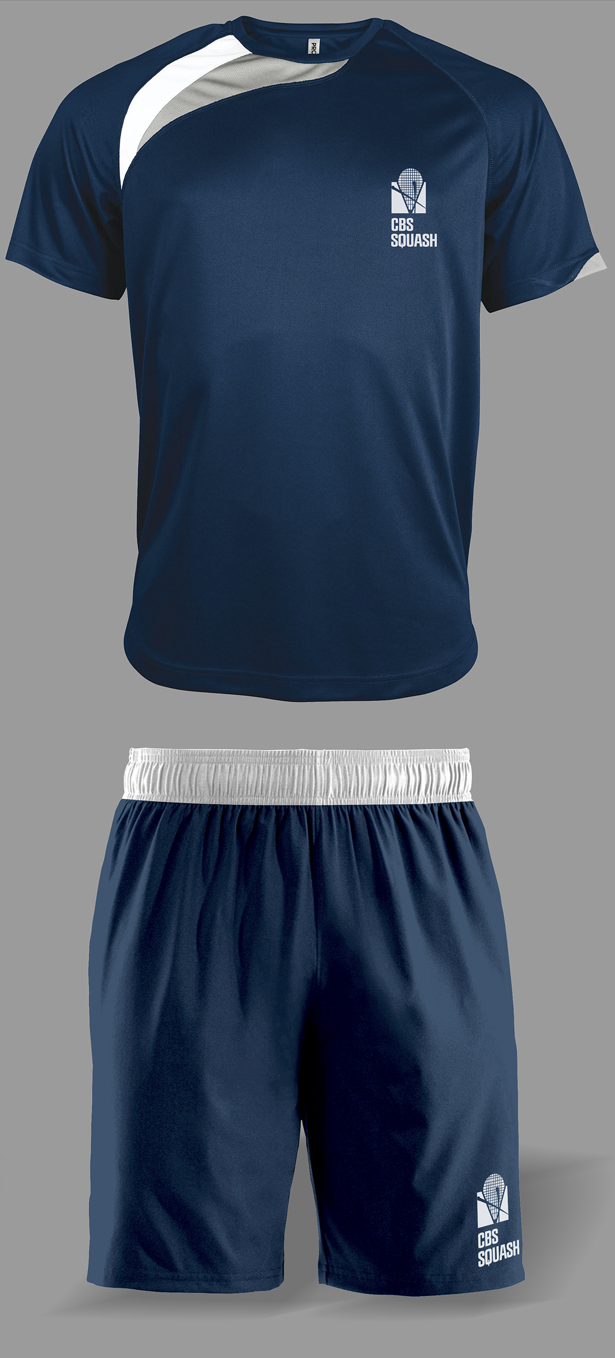
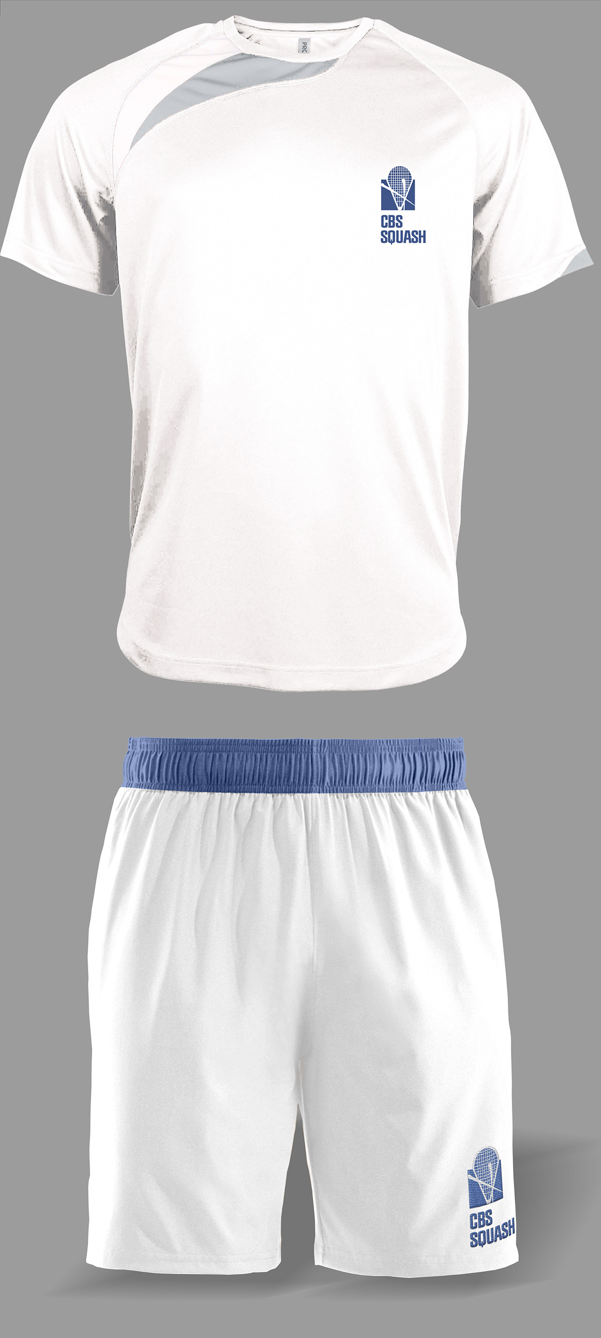
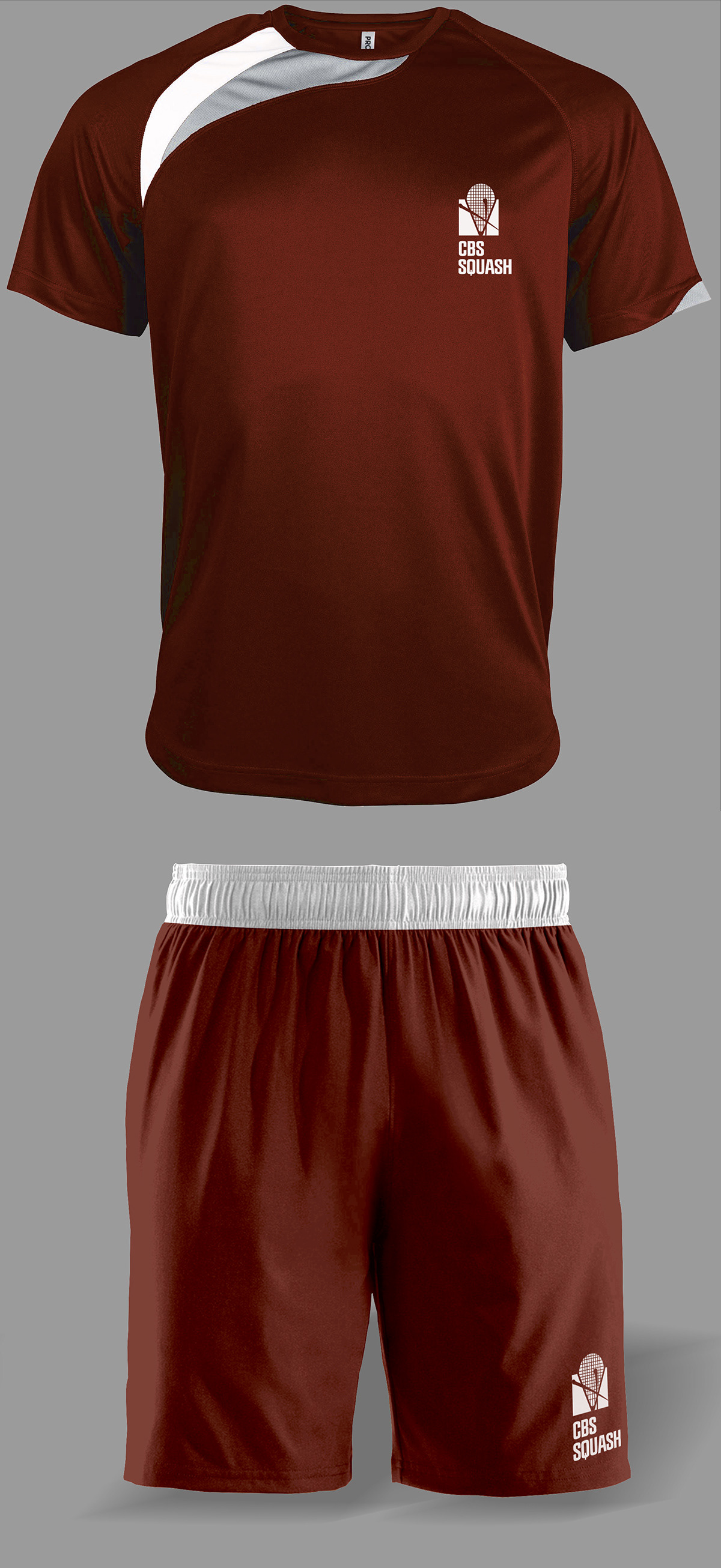
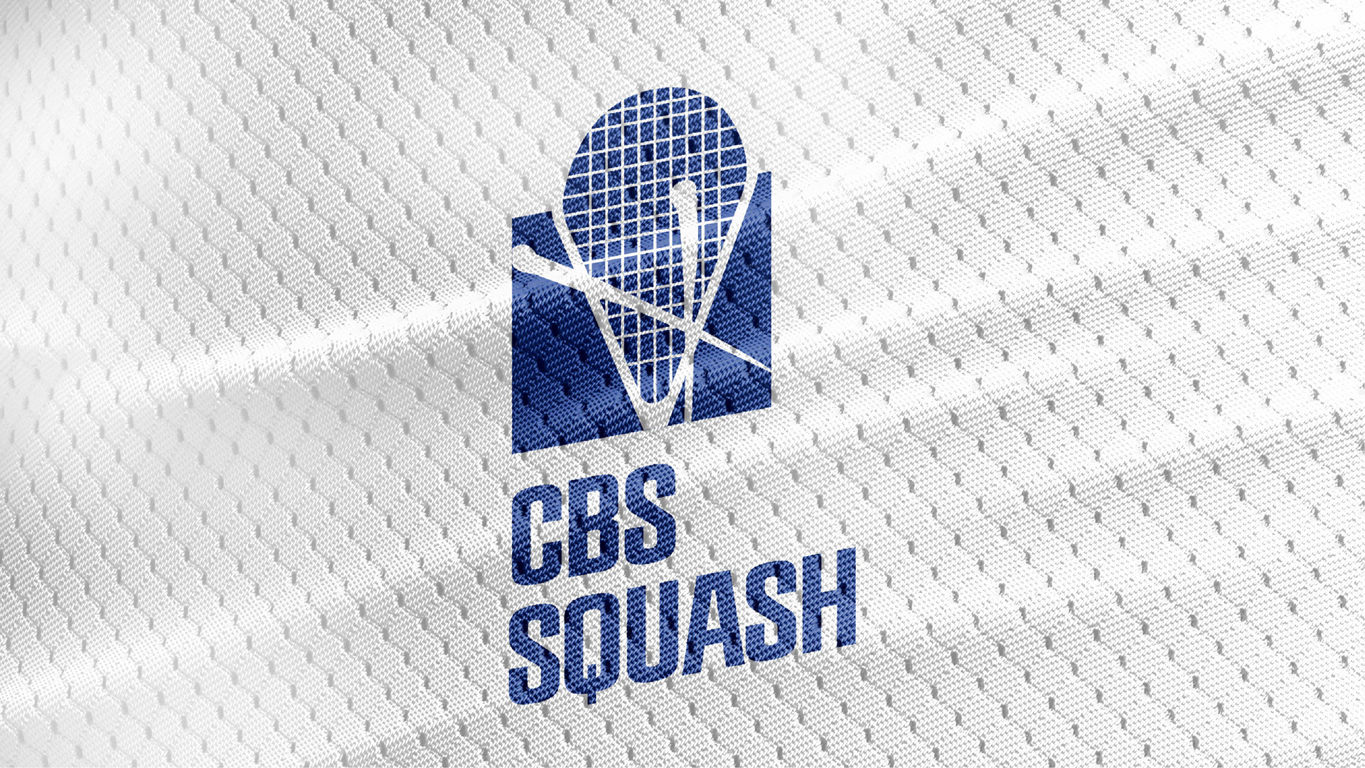
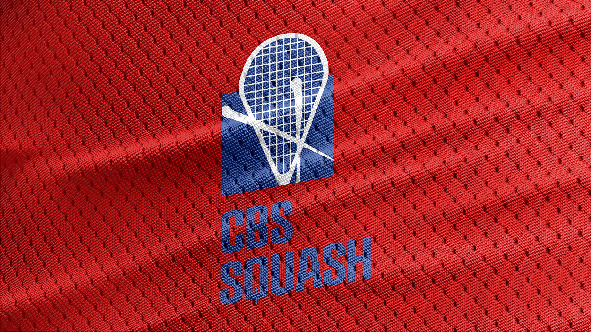
Final Logo for the Squash Club
The Solution
Drawing inspiration from the dynamic nature of squash and the current CBS logo, the design concept centred on the fusion of athleticism and academic prowess. The logo features bold, fluid lines evocative of squash ball movements. By integrating related images and typography, was crafted a harmonious and recognisable logo for Copenhagen Squash Club.
The Impact
This new identity and logo serve as a testament to the shared passion for squash and the collective pride in being associated with CBS. It resonates with both seasoned players and newcomers, fostering a sense of belonging and camaraderie within the club and its wider community.